Selected website directions

Different businesses.
Different first moves.

A bakery needs to make you hungry. An island inn needs to put you somewhere. An accountant needs to make the first conversation feel easier.

These UpOnUp design studies show what changes when the opening is built around the visitor’s question, rather than a familiar template. They are design work, not claims of launched client projects.

Explore the pages See our own site in practice

01 / Food & hospitality

The Gingered
Peach.

Show the food first, then make choosing and visiting feel simple.
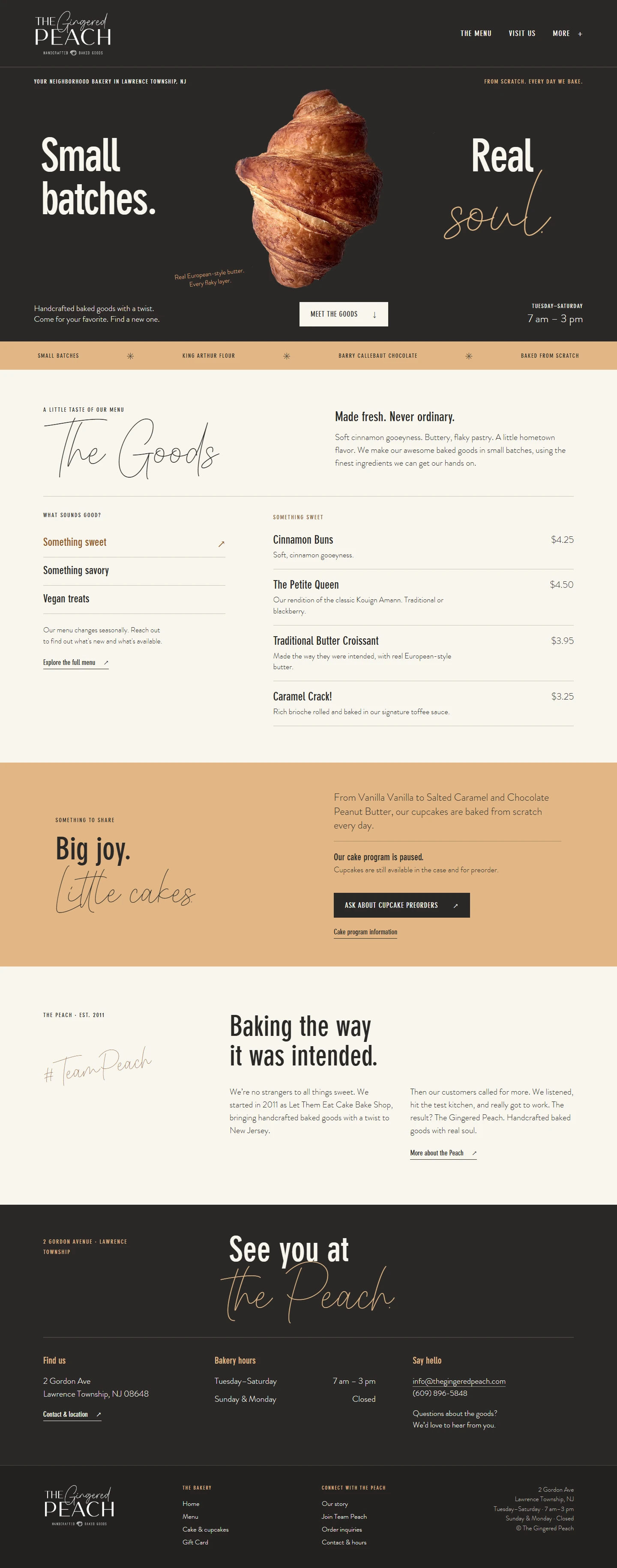
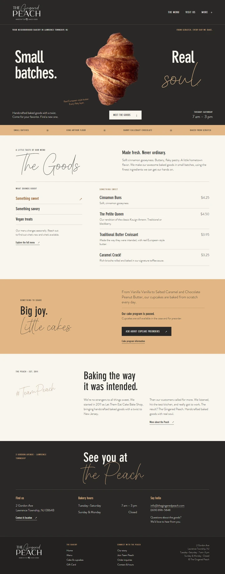
Bakery page opening with a large croissant on a dark background.
The bakery page's menu names pastries, describes them and shows prices.Menu
The bakery page's visit section shows its address, opening hours and contact details.Visit
Dark space and a single pastry give the product the opening. The menu and visit details follow on the same page. Open the full page image

What the page answers

What can I get,
and where do I go?

The croissant has room to be the headline image. The short “small batches” message sets a tone without delaying the practical details.

Scroll down and the page changes pace: named menu items carry descriptions and prices, while the closing section gives the address, opening hours and a direct way to get in touch.

Design decision

Use a highly visual first screen for appetite, then a more orderly layout when people need to compare food and plan a visit.
02 / Travel & hospitality

Fogo Island
Inn.

Give the place room to speak before asking someone to plan a stay.

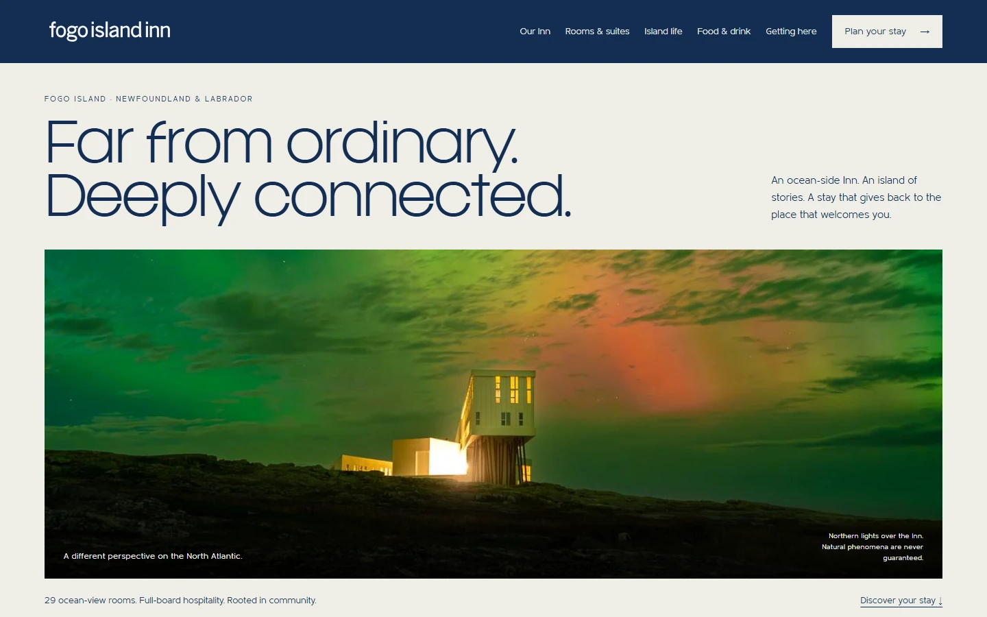
Fogo Island Inn page with expansive navy typography above a photograph of the illuminated inn beneath a green and orange sky.
A restrained opening and a wide landscape image establish the setting before the practical stay information.

What the page answers

What would it
feel like to be there?

“Far from ordinary. Deeply connected.” occupies the quiet upper half. A wide photograph then carries the scale, weather and isolation of the location in a way a list of amenities could not.

The navigation keeps the next decisions close: rooms, island life, food, getting there and planning a stay. The page can be atmospheric while still letting a visitor act.

Design decision

Let photography create the sense of place, but keep the paths to practical trip planning visible.

03 / Accounting & advice

Little Fish
Accounting.

Make a professional service feel human, specific and easy to approach.

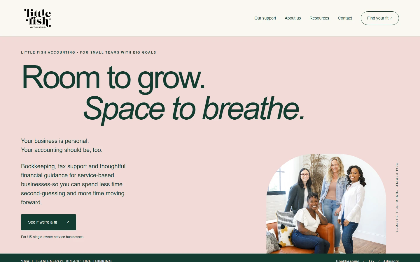
Little Fish Accounting page with a soft pink background, large Room to grow headline and a group portrait beside the introductory copy.
The opening pairs a clear audience and service description with a warmer visual tone and a direct next step.

What the page answers

Is this the right
support for me?

The small line above the headline names the audience: small teams with big goals. The copy below names bookkeeping, tax support and financial guidance, and the call to action asks whether the visitor is a fit.

Soft pink, large dark type and a group portrait make the opening approachable without hiding what the service is for. The phrase “for US single-owner service businesses” gives another useful qualification before someone enquires.

Design decision

State who the service is for and what it covers before relying on visual warmth to build the first connection.

04 / Furniture & craft

Understory
Woodworking.

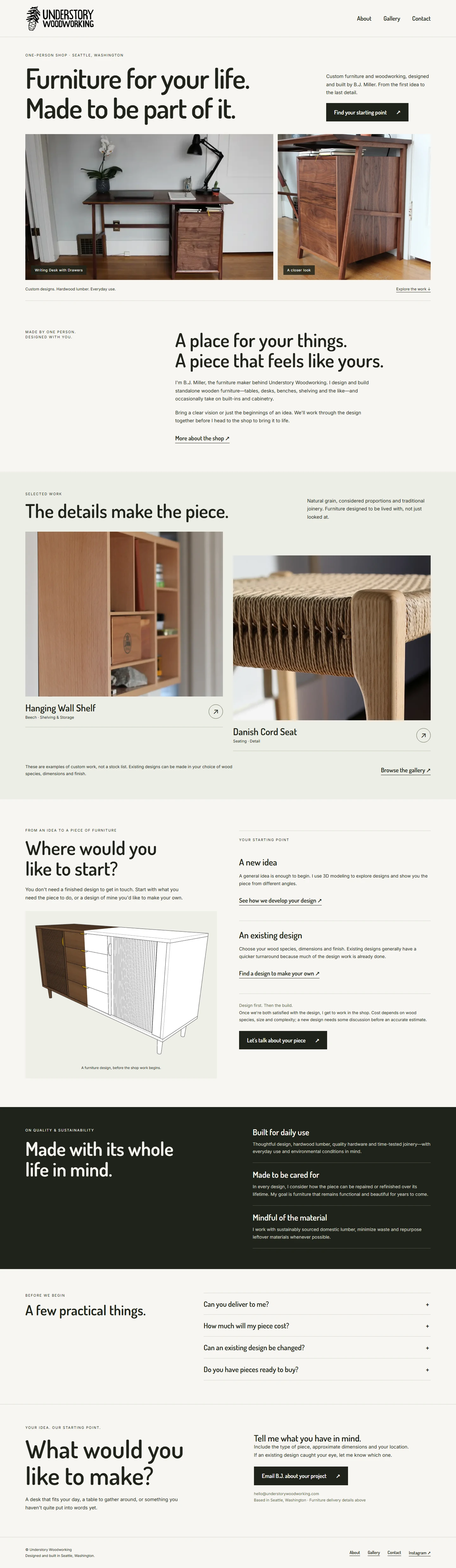
The first screen is just the beginning. This page introduces the furniture, names the maker, shows selected details, explains how a project can start and deals with practical questions before asking for an email.

Full Understory Woodworking page showing furniture photography, maker introduction, selected work, project starting points, practical questions and contact details.
One page, with a job for each section.
  1. 01 / Show the work

    Start with the furniture.

    Two prominent photographs put the objects themselves beside the opening promise.

  2. 02 / Introduce the maker

    Give the work a person.

    The short maker introduction explains who designs and builds the pieces.

  3. 03 / Help someone imagine a project

    Show the next step.

    Selected pieces lead into two starting points: bring a new idea or adapt an existing design.

  4. 04 / Remove uncertainty

    Answer before the email.

    Delivery, cost, changes to an existing design and ready-to-buy pieces are covered before the contact invitation.

Inside UpOnUp / Our own website

The decisions we make
on our own site.

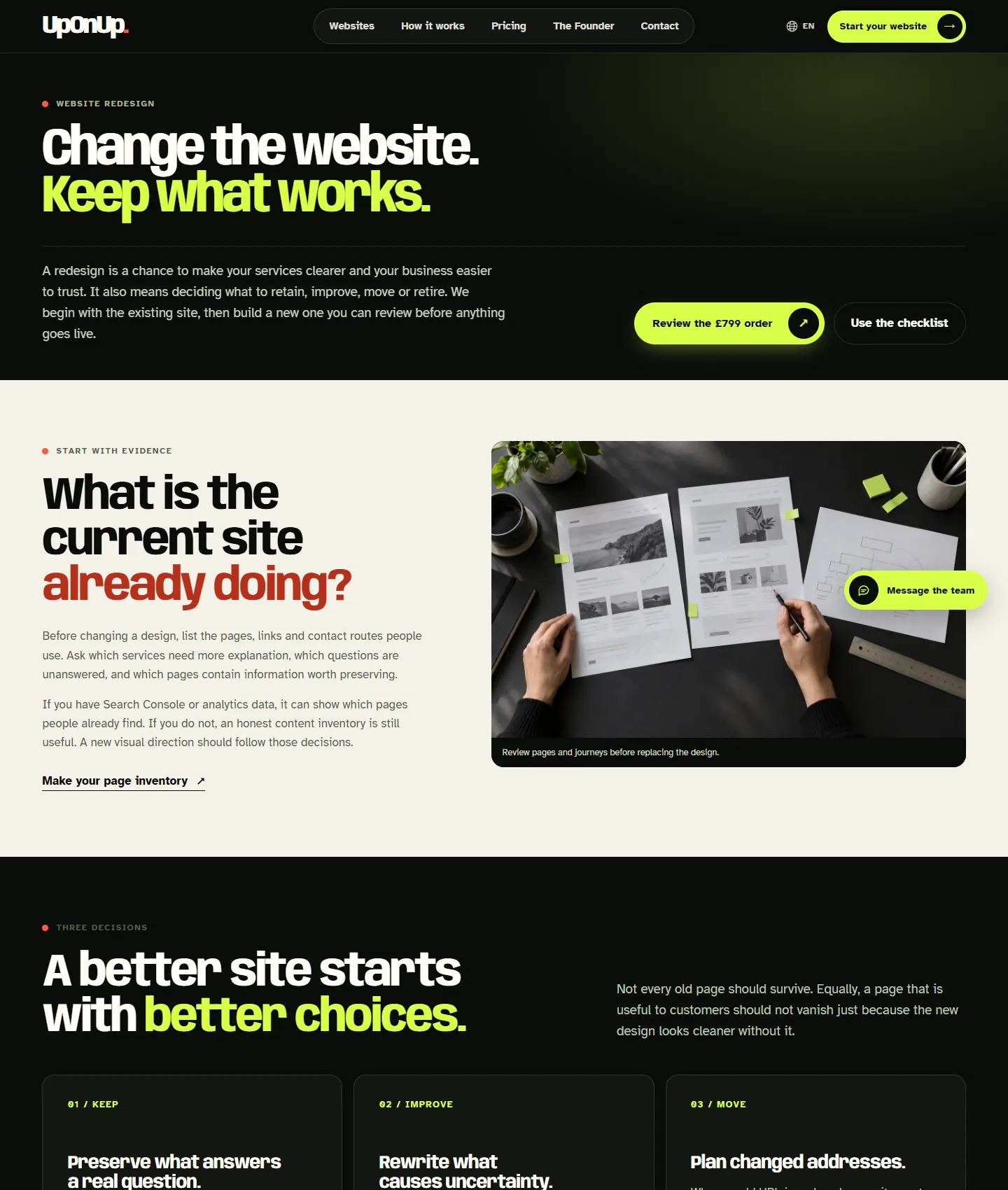
The redesign page below is part of this website. It starts with the existing site, explains what happens to useful pages and gives a visitor a clear route to review the order or use the checklist.

Desktop view of UpOnUp's website redesign page showing the opening promise, order link, checklist link and page review section.
Our redesign page, captured during the September 2026 site review.
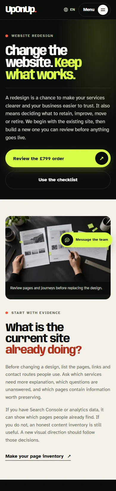
Mobile view of the same UpOnUp redesign page, with its opening actions stacked above the page review section.

What we checked

A page has to work after the design is approved.

We use our own site to test the less glamorous parts of the journey as well as the opening screen. These are specific checks, not claims about rankings or enquiries.

Inspect the live redesign page
01 / Missing pages

The URL should say what happened.

A missing address on our site had served the homepage with a success response. We added a real 404 page and checked that an invented address now returns HTTP 404.

Read the launch checklist
02 / Unavailable chat

An enquiry route should still be visible.

We checked the site with the chat service unavailable. The “Message the team” action then offered the contact form. That local check does not prove an email was delivered.

Read the enquiry check

Your business has its own questions

Make a page that
answers them well.

We start with what people need to understand about your business, then choose the words, images and page structure that help them get there.

Message the team