Restaurant website examples: compare the choices
A harbour-side Italian restaurant and an expressive Soho dining room call for different websites. These two designs from UpOnUp’s portfolio show how the character of a place can shape its menus, pages and route into planning a meal. Look through the details, then pick the choices that would earn their place on your own website.
Two ways to help
someone choose a restaurant.
Compare how each design handles the same job. Open the pages below to see the detail in context.
| The visitor’s task | Angelos | Asylum |
|---|---|---|
| Set the first impression | The harbour, coastal colours and food place the restaurant in its surroundings. A brief in this direction needs photographs that say something about the setting. | Orange, large lettering and the chrome eye lead with a strong identity. A brief in this direction needs a visual idea that belongs across the menu and room pages too. |
| Help someone choose a meal | Food categories let visitors jump to pasta, pizza or fish within one menu. Useful when guests often arrive with a dish or type of food in mind. | À la carte and tasting-menu sections explain different ways to dine. Useful when format and time at the table affect the choice. |
| Give an occasion enough space | Sunday lunch gets its own food, hours and page. Choose this when a particular service has enough detail to warrant a separate explanation. | Private dining gets its own room, group size and arrangements. Choose this when a group organiser needs answers beyond the everyday menu. |
| Shape the planning step | One form groups the meal, date, party and time, followed by a review. A compact pattern for a few familiar services. | An experience choice carries into a planner with successive steps. A useful pattern for several dining options, with more steps to move through. |
Coastal Italian restaurant
Angelos
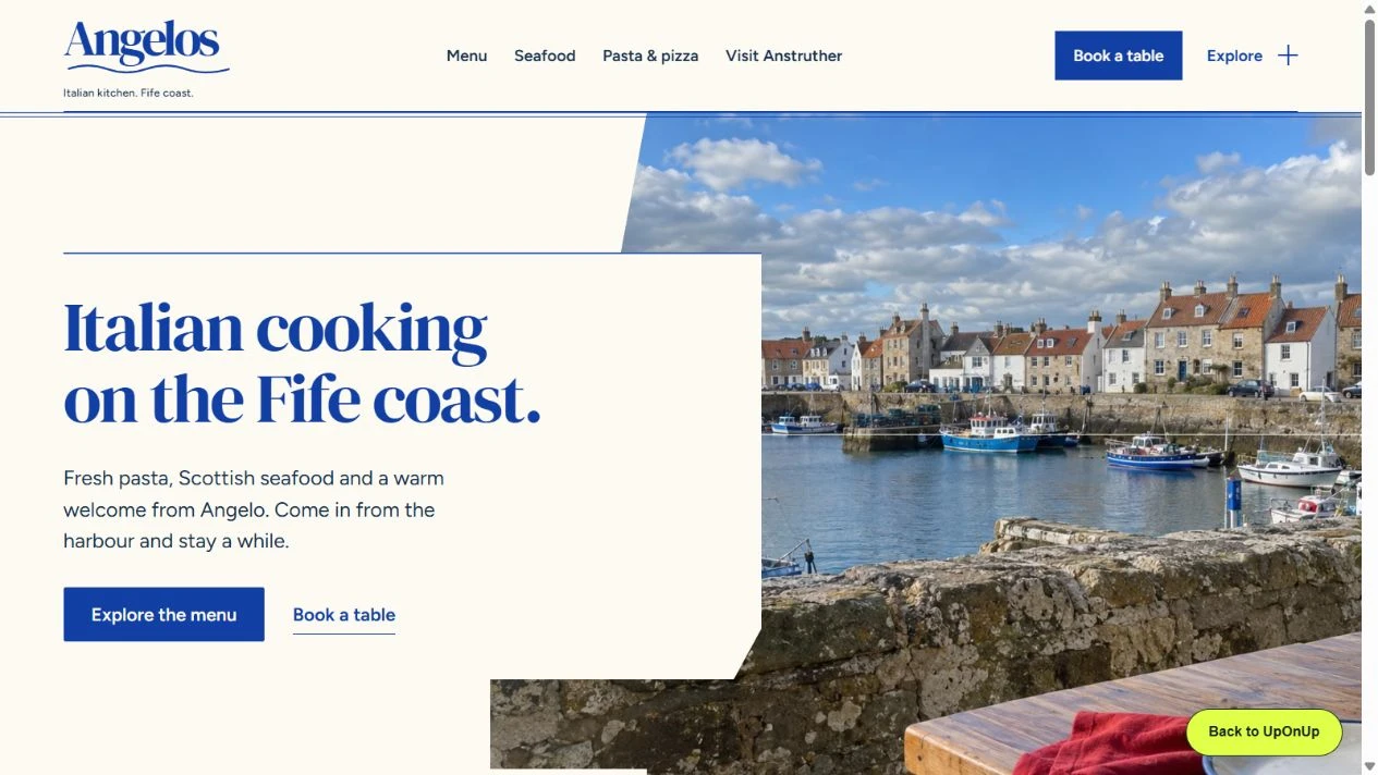
Coastal blue, warm cream and harbour imagery give Angelos a sense of place. The menu divides into recognisable food sections, while Sunday lunch gets a page of its own.
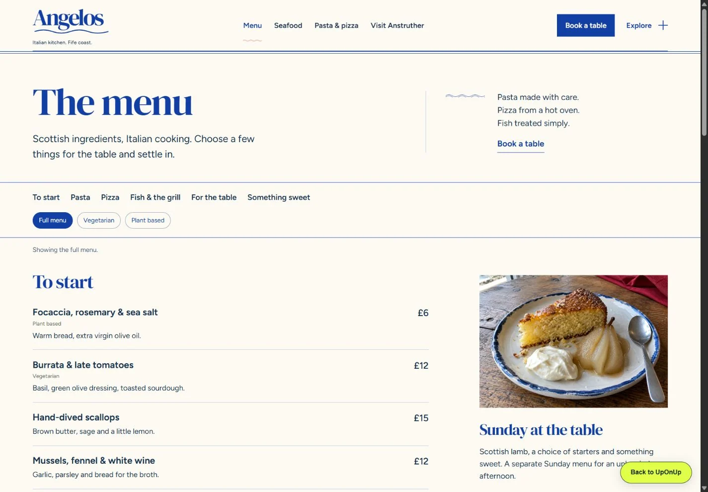
Jump straight to the food you fancy
The menu has links to starters, pasta, pizza, fish, sides and desserts. Open the pasta section and you arrive at named dishes and descriptions. This is a useful arrangement for a broad menu: familiar categories give people a way in, and the rest of the meal remains on the same page.
Look through the pasta section in a new tab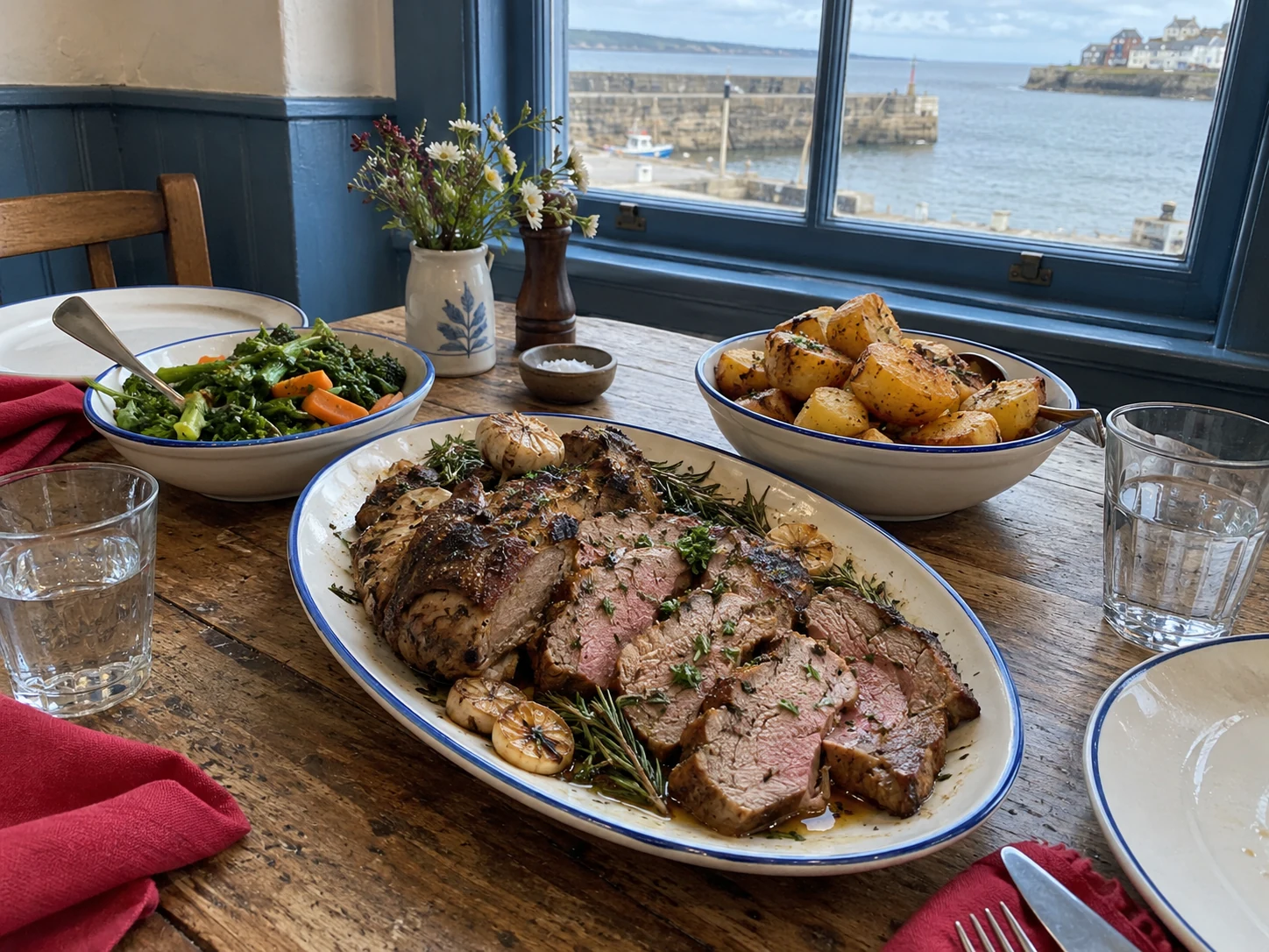
Give a different meal its own page
Sunday lunch has its own photograph, course choices and service hours. It reads like a particular afternoon at the table. A separate page makes sense when the meal has enough of its own character and detail; a short variation on the everyday menu may only need a section.
Explore the Sunday lunch page in a new tab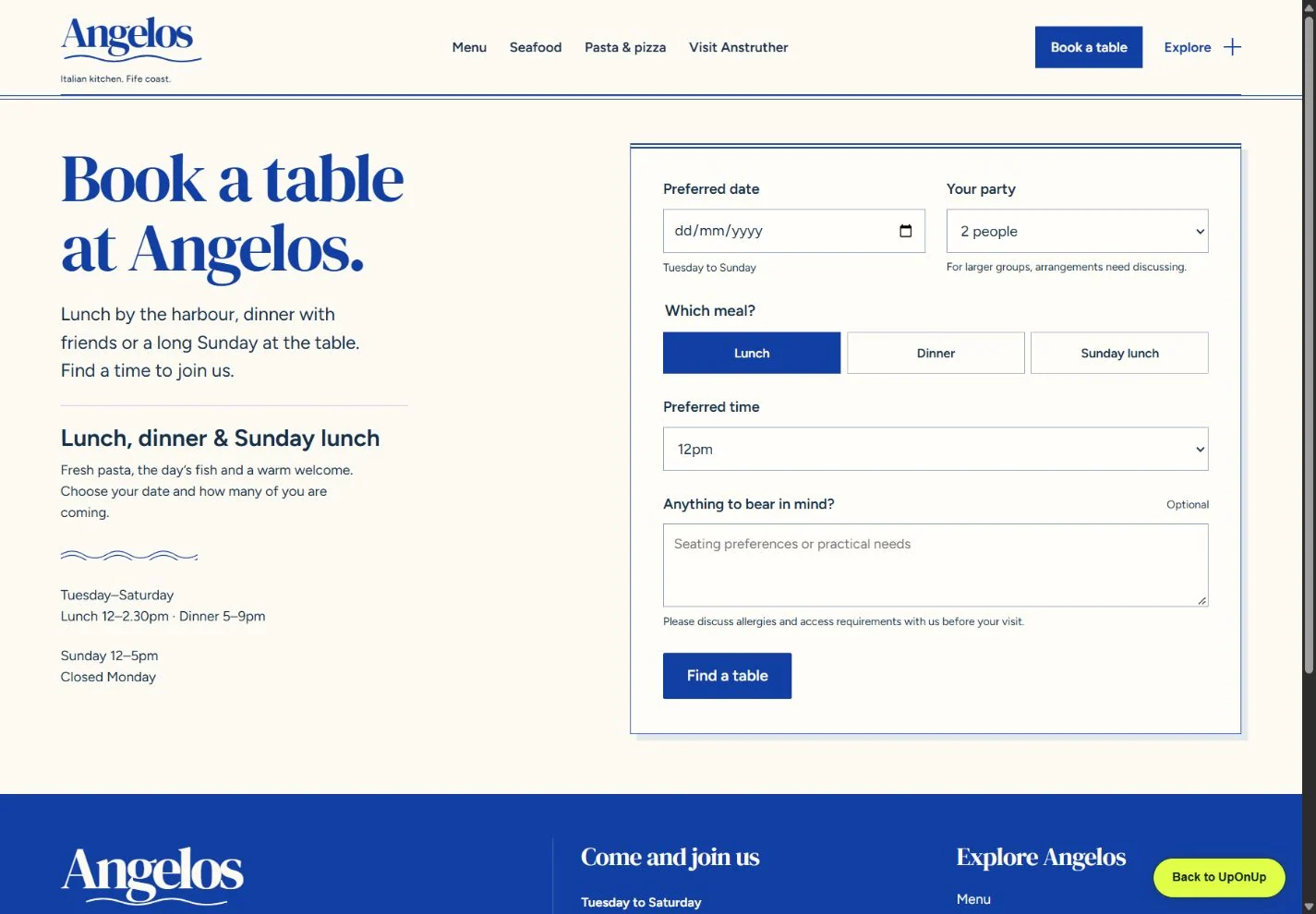
Choose the meal alongside the date
Lunch, dinner and Sunday lunch appear together with the date, party size and preferred time. The review brings those choices onto one screen. That compact approach fits a small number of services; adding several rooms, menus and packages would need more explanation.
Try the Angelos table planner in a new tabThe Angelos planner lets you review preferences. Online booking is unavailable; it does not send a reservation or reserve a table.
Modern restaurant with private dining
Asylum
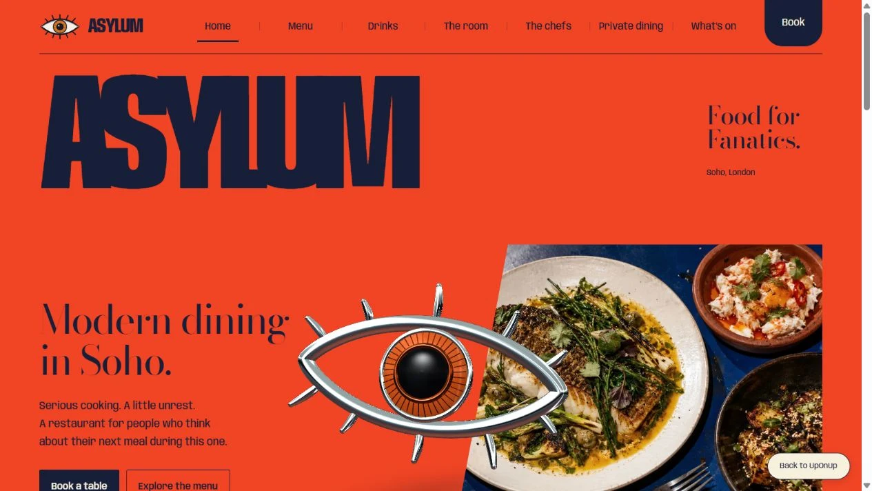
Bright orange, oversized lettering and a chrome eye give Asylum an unmistakable opening. The food and dining room follow that expressive lead, with routes for a tasting menu and a private gathering.
Explain the choice between dining formats
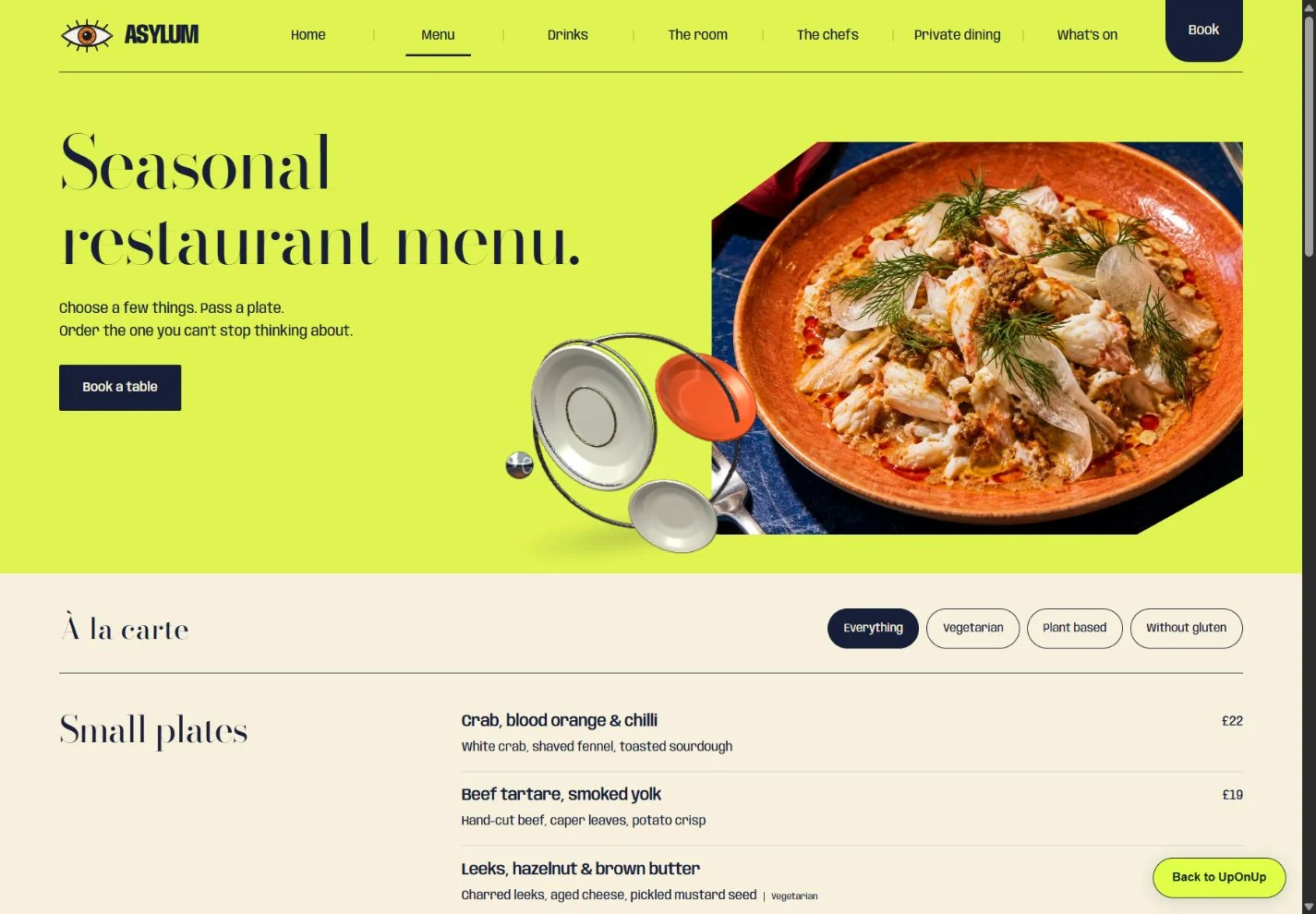
The à la carte menu groups dishes by course, while the tasting menu explains its sequence and how long to allow. That helps someone choose the shape of the evening. It also creates two things to maintain whenever the food or dining format changes.
Compare the menu formats in a new tab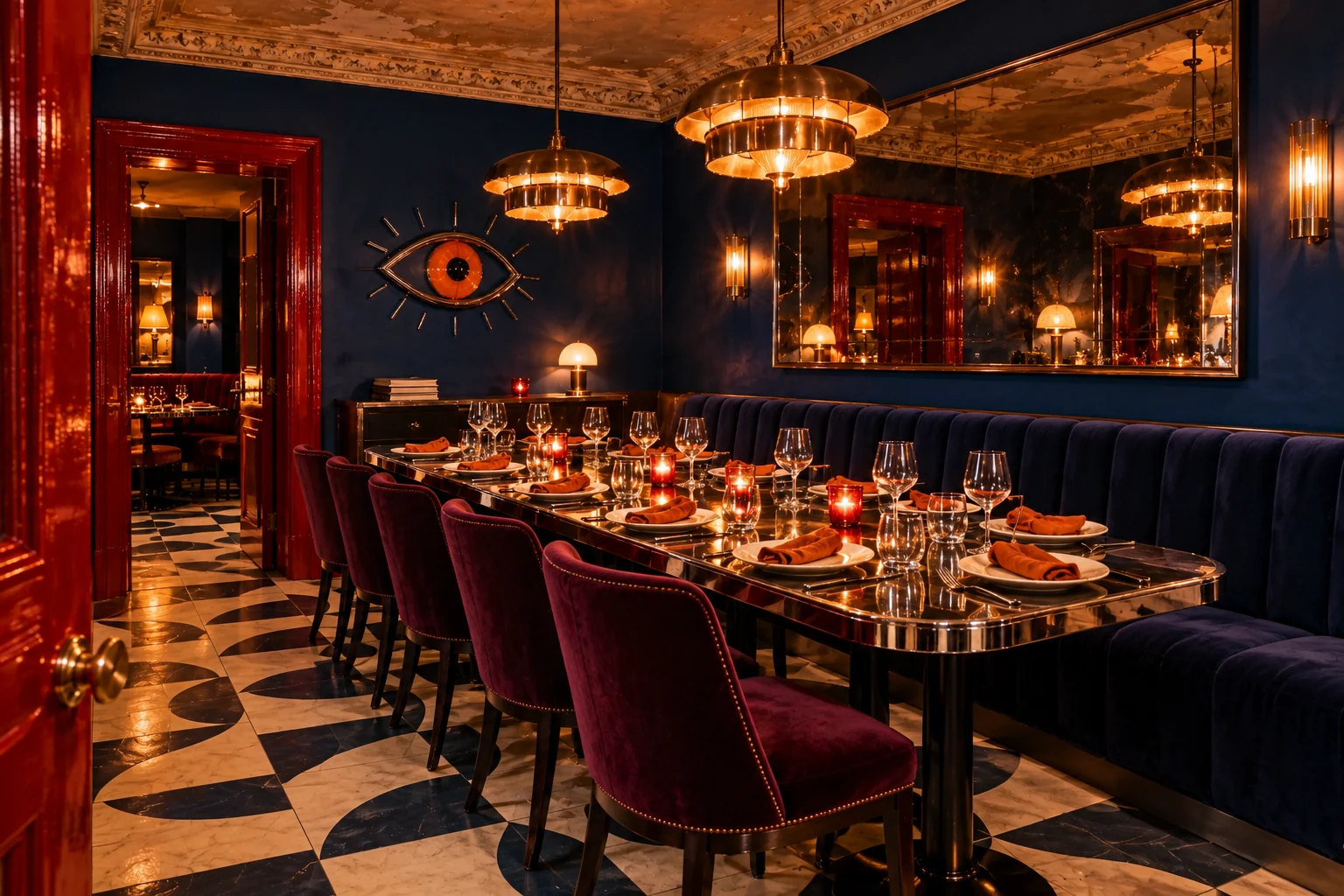
Give the group organiser room to decide
Private dining has a room photograph, a group size of eight to eighteen and an explanation of the shared menu. The organiser can picture the gathering and see what needs agreeing. This deserves its own page when the arrangements differ from an ordinary table.
Look through private dining in a new tab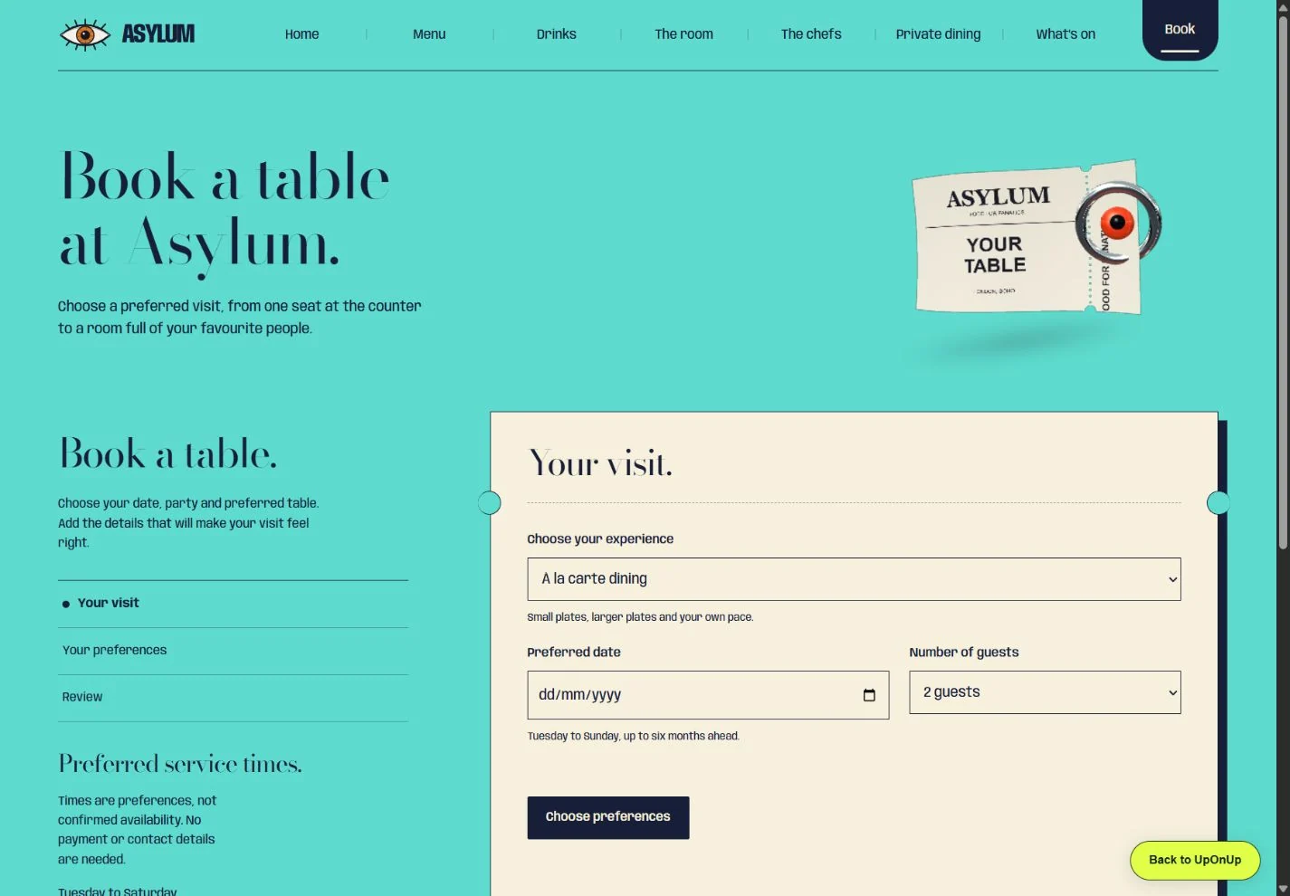
Carry the chosen experience into the planner
The private-dining link opens the planner with that experience and eight guests already selected. Date, time and preferences follow in steps. It keeps an earlier choice in place, though a restaurant with fewer options could reasonably keep everything on one screen.
Try the private-dining planner in a new tabThe Asylum planner can download your selection as a text file on your device. It does not send the details or reserve a table.
Which details would
you take into a brief?
Choose up to six ideas and add a few words about your own restaurant. The download keeps the website links and your notes together.
Your choices and notes are kept in this page and are not sent to UpOnUp. Download a copy to keep them, and review it before sharing.
What do you like, why would it suit your restaurant, and what would you change? Up to 600 characters for the download. Longer notes stay here so you can edit them.
0 / 600 characters
A starting point for your designer.
No ideas selected. A blank download gives you prompts for the brief.
Download the comparison (.txt)Download a blank comparison worksheetUse these preferences to discuss the website brief and agree any booking or ordering connection.
Also from our work
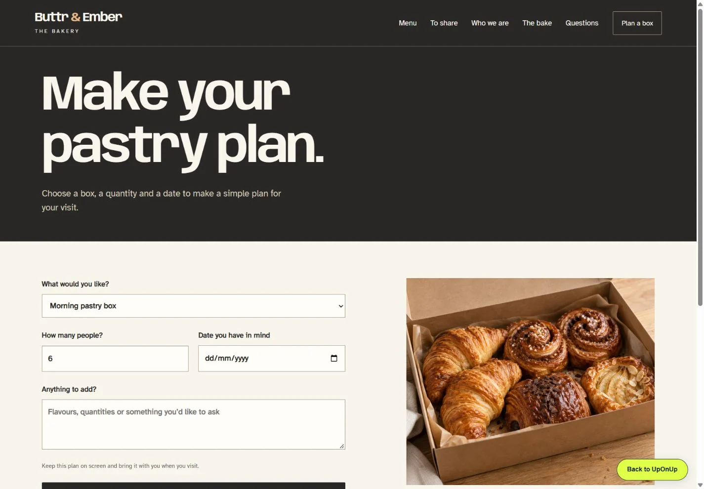
Buttr & Ember
The bakery gives pastry most of the opening screen, then offers morning, savoury and sweet sharing boxes. It is a useful comparison if your restaurant also sells food for collection.
Each box leads into the pickup planner with the choice already selected. That connection is worth considering for a small collection offer. A larger takeaway menu needs an ordering setup that can handle changing availability and collection times.
The bakery planner creates an on-screen plan. It does not place an order, reserve stock or take payment.
Turn the choices into a brief
Keep the choices that fit the way your restaurant works, and write down what you would change. A few chosen details and the reasons you like them give a designer something useful to work with. If you’d like UpOnUp to help, send us your current website and the choices you’ve saved.