Buttr & Ember bakery website design
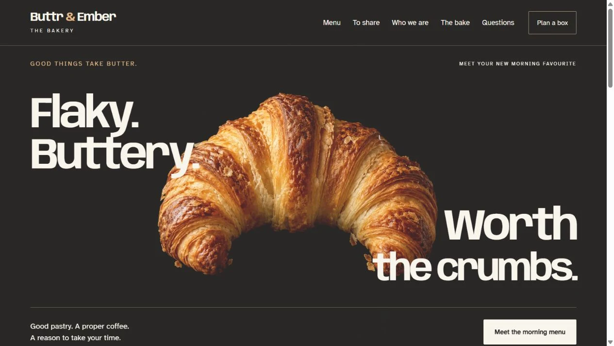
The croissant gets most of the opening screen, and that feels right for Buttr & Ember. Warm pastry against a dark background does the inviting; the rest of the seven-page website helps you decide what you'd like, read about how the pastry is made and put together a box to share.
- Project
- Website design and build
- Website
- 7 working pages
- Created by
- UpOnUp
What this website needed to do.
Make the food the reason to look around, then help someone go from spotting a pastry they like to finding the menu or planning a larger pickup.
The decisions behind the design.
Lead with the food and a useful choice
We gave the pastry plenty of space, with large cream lettering and a direct link to the menu. Scroll a little further and you can browse sweet, savoury and plant-based choices. There's something to look at and something to do from the start.
Explore the bakery homepage in a new tabGive the menu enough detail
A photograph can make you hungry, but it doesn't tell you what's inside. Each menu item has a name, description and example price to help you choose. A separate note asks visitors to check ingredients and preparation with the bakery, especially for an allergy or dietary requirement.
Explore the full menu in a new tabConnect sharing boxes to the next step
The sharing page makes room for a different sort of visit: bringing breakfast for the office or a box for the weekend. Morning, savoury and sweet boxes each link into the pickup planner with the choice already selected. You can carry on from the box you liked.
Explore the sharing boxes in a new tabKeep pickup planning short
Choose a box, say how many people it's for and pick a date. The planner brings those details together in a short on-screen summary, keeping the amount of typing down. It doesn't send an order, reserve stock or confirm a collection slot.
Try the pickup planner in a new tabExplore Buttr & Ember.
Have a look around. You can open the pages and try the website at desktop and mobile sizes.
The pickup planner creates an on-screen summary. It does not place an order or reserve stock.
How the pages fit together.
Here's what you can explore beyond the homepage.
- Home
- Food-led introduction and menu categories.
- Menu
- Sweet, savoury and plant-based selections.
- To share
- Pastry boxes and links to plan each choice.
- Who we are
- The team page and bakery identity.
- The bake
- An explanation of the pastry-making approach.
- Questions
- Pickup and ingredient questions with relevant links.
- Plan a box
- Box choice, group size and date summary.
What to take into your own website.
The details will be different for your business, but these are useful places to start.
- Let the food take up space, then put names, descriptions and prices close enough to help someone choose.
- If someone has already picked a box, carry that choice into the next step.
- Taking payment, tracking stock and reserving collection slots need their own agreed setup beyond a simple website.
Let's plan your website.
Tell us what you do and what you'd like your website to do better. We'll help work out the pages, write the words and build a design that feels right for the business.