Start with something a new visitor can understand.
Your business name may be familiar to you and completely new to the person arriving. The opening needs to explain the work. A line about “exceptional solutions” leaves the visitor doing that job themselves.
Write the ordinary explanation first: the service, the people it is for and the place or way you deliver it when that matters. An electrician visiting homes needs to make coverage understandable. A remote bookkeeper may need to explain the kind of business they work with instead. Use the facts that help someone decide whether to continue.
Then give that explanation some character. The photograph, wording, colour and spacing can all make the business feel distinctive. Check that the basic answer is still easy to find when the design is finished.
Choose the routes your customers actually need.
A visitor might know exactly which service they want, or only know the problem they need solved. Name the main services clearly and add a short explanation when the distinction needs help. Give each link a destination that continues the same subject.
A garden-care customer should be able to find ongoing maintenance without reading through an entire garden redesign. Equally, one service should not appear as four nearly identical choices just because you use several names for it. Our page-planning guide helps decide which subjects need separate pages.
The homepage can introduce your range without reproducing every service page. Explain enough to choose, then let the next page handle the scope, process and questions for that work.
Two businesses. Two different opening decisions.
These examples are from websites we designed. Look at what the words and links help a visitor do, as well as how the pages look.
Highland: understand the work, then choose a route.
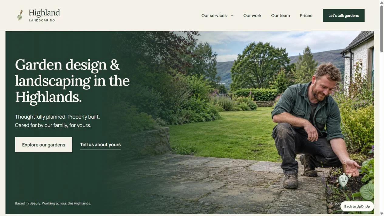
The opening names garden design and landscaping, then the Highlands. Two links serve different visitors: “Explore our gardens” leads towards the work, while “Tell us about yours” leads towards an enquiry draft. Someone can look around or start describing what they need.
Further down, the homepage separates garden design, landscaping, stone and paving, planting, and care. Each has a short explanation and its own route. Project previews and a team introduction then give the visitor more to inspect.
The useful lesson is the order of information: an understandable offer, choices within that offer and reasons to keep considering it. For your own website, use your genuine service range, coverage, people and permitted project material. The preview’s enquiry tool prepares a draft to copy or download; it does not send a message.
Asylum: character alongside a practical choice.
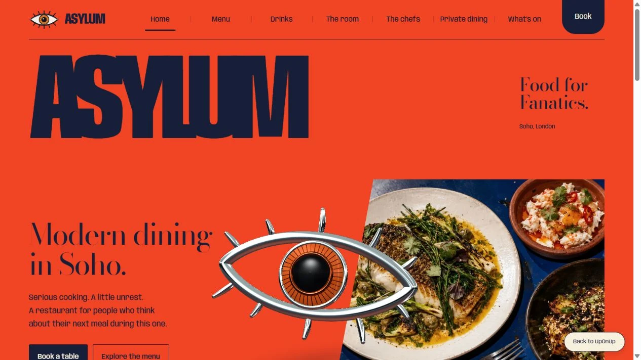
The large wordmark, orange background and sculptural eye give Asylum its character. The opening also says “Modern dining in Soho” and puts menu and table links nearby. The food and room get more space as the page continues.
A restaurant visitor may want to read the menu before deciding on the evening. Giving that action a clear place is useful even when the eventual aim is a booking. In this preview, the table route opens a local preference planner, not live availability or a reservation service.
You do not need to borrow the restaurant’s visual style for a service business. Borrow the discipline of keeping practical information easy to find within a distinctive design.
Show something that helps the decision.
Pick a project, product detail or explanation that supports the service you want people to understand. Give an image enough context to mean something. A close-up of a finish might demonstrate a particular choice; a whole-room view might explain how the space works.
A homepage does not need every project. Select a useful introduction and link to the fuller story. Use the case-study guide when a job deserves its own explanation, or the image guide when you need to gather material.
If the business is new, introduce the people and explain how you approach the work. An original sample or design study can give someone something useful to explore. Say what you set out to make and show the choices behind it.
Make the invitation fit the decision.
Give a visitor who is ready a clear way to contact you. Someone still comparing may need the service, a project or the process first. Choose those routes deliberately; a row of equally prominent buttons can leave the decision just as unclear as no button at all.
Say what the next step involves. If you must check the job before quoting, an invitation to describe it is more accurate than a promise of an instant price. The quote-request form guide covers which questions help with that first reply.
Google’s link guidance recommends descriptive links that give readers and search engines context about the destination. Use ordinary labels that match the page. A clever label is not doing much for you if nobody knows where it goes.
Make a content outline before arranging the sections.
Use these prompts to gather the homepage material. They are decisions to make, not seven compulsory blocks or a fixed order for every business.
- The opening: explain the work, audience and relevant coverage in words a new customer would use.
- The main choices: list the services people must distinguish, the short explanation each needs and its destination page.
- The evidence: choose the project, image or detail that supports the offer, with permission and a useful caption.
- The people: decide which real person, role or working approach matters to the buying decision.
- The practical answers: identify the question that commonly delays an enquiry, such as coverage, visiting arrangements or how a quote is prepared.
- The next step: name the main action, what happens afterwards and a useful route for someone still considering.
- The maintenance: record who checks changing facts, including availability, hours, featured work and prices.
Download the blank homepage content outline to work through these prompts with your team or designer. Keep unresolved facts visible until someone can confirm them.
Review it as a first visit, not a familiar page.
Ask someone who does not know the business to open the homepage on a phone. Can they explain what you do, choose a relevant service and say what will happen when they contact you? Ask them to show you where they found each answer.
Check the smaller screen with the menu closed as well as open. Essential information should not depend on a desktop-only layout or someone knowing which picture to tap. Then follow the actual service and contact paths. A convincing opening and a working enquiry route are both worth checking.
Bring the business. We’ll help shape the introduction.
Tell us what you do, which work you want more of and what customers usually ask before getting in touch. We can use that to plan the homepage and the pages it needs to connect.